Showing posts with label Graphic Design. Show all posts
Showing posts with label Graphic Design. Show all posts
20100215
20100205
Humble Pied
 Humble Pied originally started as a crowd-sourced AIGA student presentation, with friends and peers alike offering their words of wisdom within the creative industry. www.humblepied.com houses all of the great bits of advice, and to stimulate dialogues along the way.
Books Transformed Into Art by Su Hee Lee


An intricate handmade dissertation book about Book Art especially
focused on Altered book which using a found book transformed
into an art form. This book contains the deep knowledge of
Book Art field and experimental processes of mine.
Pages are decorated by needlework. It is also cut out every page
making a butterfly shape out of the pattern. Book cover is made by
leather title engraved.
Labels:
book design,
Graphic Design,
layout,
papercraft,
portfolios,
Typography
Milk Cartons-Yael Mer & Shay Alkalay


These three different milk cartons distinguish between the rates of fat in the milk by using form rather then colour. The form of the milk cartons reflects in a way on the milk’s texture and smoothness. The two back folds are used as the carton's handle, while the two in the front function as the spout.
contact
info@raw-edges.com
How to make a Paper Infinity Card
Toymaker and illustrator, Marilyn Scott Waters, has been creating marvelous paper toys and sharing them freely for many years. Today I got word that she's made some of her lovely watercolor art into two pdfs free for the download so that we can all make an Infinity Card.
If you're not familiar with Infinity Cards, they are one of my personal all time favorite paper card mechanisms and are really quite magical to see in person. To make it even sweeter, they are super simple to construct. No kidding. It's just four strips glued at four corners, making a two-sided square, that flips open in panel combination after panel combination.
I've made several of them myself as art pieces, where I've made wording on each panel combine to reveal meaning no matter which way the panels are flipped. I highly recommend trying to make a few to see how fun they can be for yourself. And Marilyn's gift might be an endlessly helpful introduction.
20090314
Rebranding- Tropicana goes back to old packaging

One aspect of the new Tropicana packaging is being kept: plastic caps for the cartons, that are shaped and colored like oranges.


Tropicana is to go back to its old packaging designed by Sterling Brands, following many complaints of dislike for the new packaging designed by Arnell Group.The redesigned packaging that was introduced in early January is being discontinued, bringing the old one back. Tropicana claim that the change is due to the opinion of the few, and not the many,
“it was a fraction of a percent of the people who buy the product".
Personally, I think the change is eye-catching but very plain & bland, the design does not reflect the product. Which is one of the reasons i think it has failed.The number one complaint I've heard is that it's harder to find the specific type of juice (Ruby Red, Lots of Pulp, Calcium, etc.) you're looking for. Ive also heard people say that the new version looks more "generic."
Tropicana's equity lies in the fact that they own the orange. The symbolism of a straw stuck pushed straight through the skin of an orange is the very definition of freshness and purity. Stripping the layers of meaning away by using an image of a glass of orange juice suggests that of a me too (copycat) brand. One that does not own the definition of an orange bursting with juice, but 'just' a product, being poured into a glass. The new design suggests the product is not special, not different & definitely not ownable. This said I wouldnt personally say that the juice box couldn't have done with a redesign, but it needs one that understands, respects and makes use of the equities in an established, & well respected brand.
(images courtesy of flickr)
20090312
Aides Posters


 AIDES is a European HIV/AIDS NGO founded in 1984. They recently commissioned two safe sex posters with the theme "Explore. Just Protect Yourself" which won a bronze medal at Cannes.
James Dean
Advertiser/Client: AIDS
Product/Service: AIDS AWARENESS
Entrant Company: TBWA\PARIS
Country: FRANCE
Advertising Agency: TBWA\PARIS
Country: FRANCE
Executive Creative Director: Erik Vervroegen
Creative Director: Erik Vervroegen/Michel De Lauw
Copywriter: Xander Smith
Art Director: Jonathan Santana
Illustrator: James Jean
Account Supervisor: Anne Vincent/Veronique Fourniotakis
20090309
Ampersands..


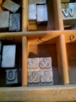
 Lately I’ve had a consuming obsession with ampersands. Seriously. What a sweet little glyph, it's kicky and cute, and the American Typewriter ampersand is tattoo-worthy ;). Perhaps most interesting is the typographic history that ampersands hold. Italic type was developed independently from roman type, and only became a roman subsidiary in the mid-16th century. Italic types were based on 15th century Italian handwriting (hence the name?) and they look thoroughly calligraphic. This is especially apparent in the italic ampersands in many old-style typefaces. It isn’t just a sloped roman, but a totally independent form!
The Ampersand-My New Obsession

I'm not the only one in love with this beautiful symbol. I found a fun site for other people like myself, who are also seduced by the letter form of the ampersand. I suggest you bookmark The Ampersand, the project concept is by Stephen Gose.
1960s modern Czech street map
Steven Harrington

‘Influenced by Time-Life Encyclopedias 1965-1972, thrift stores and the 60s pysch sounds of The Moody Blues,’ Steven’s work is hard to describe but easily brings a smile to your face. Part dream, part distant memory, his drawings always delight. Now his work is featured as the third installment of the Curated by Arkitip series, a project designed for Incase that is aimed at delivering artistically embellished Apple products to users who have an appreciation for the creative arts and technology.
Steven Harrington from Arkitip on Vimeo.
Shigeo Fukuda (1932-2009) R.I.P


Graphic design legend Shigeo Fukuda, passed away on January 11th, 2009 at the age of 76. Fukuda was a master of optical illusions, simplistic logos, and memorable posters. In 1987, he was the first Japanese designer to be inducted in the Art Directors Club Hall of Fame. You can learn more about his life and career in this obituary by Steven Heller.
Subscribe to:
Posts (Atom)


