

Powerful Imagery
Executive Creative Director: Andy Greenaway
Creative Director: Richard Copping
Copywriter: Simon Jenkins, Andrew Petch
Art Director: Ronojoy Ghosh, Ng Pei Pei
Photography: Teo Studios
(Images courtesy of Adsneeze.com)


“it was a fraction of a percent of the people who buy the product".


 AIDES is a European HIV/AIDS NGO founded in 1984. They recently commissioned two safe sex posters with the theme "Explore. Just Protect Yourself" which won a bronze medal at Cannes.
Animation done completely in Adobe FLASH, with exception of the 3d Globe with Stylized Buildings, which was modeled in MAYA, vectorized, then
imported into FLASH.


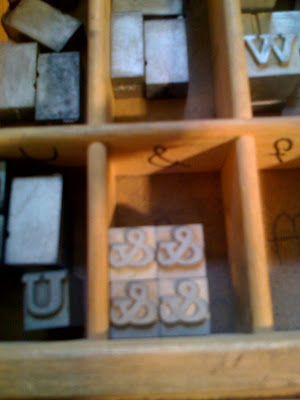
 Lately I’ve had a consuming obsession with ampersands. Seriously. What a sweet little glyph, it's kicky and cute, and the American Typewriter ampersand is tattoo-worthy ;). Perhaps most interesting is the typographic history that ampersands hold. Italic type was developed independently from roman type, and only became a roman subsidiary in the mid-16th century. Italic types were based on 15th century Italian handwriting (hence the name?) and they look thoroughly calligraphic. This is especially apparent in the italic ampersands in many old-style typefaces. It isn’t just a sloped roman, but a totally independent form!